Visual and UX design principles can improve the effectiveness of poster sessions
︎Derek Crowe, May 2019
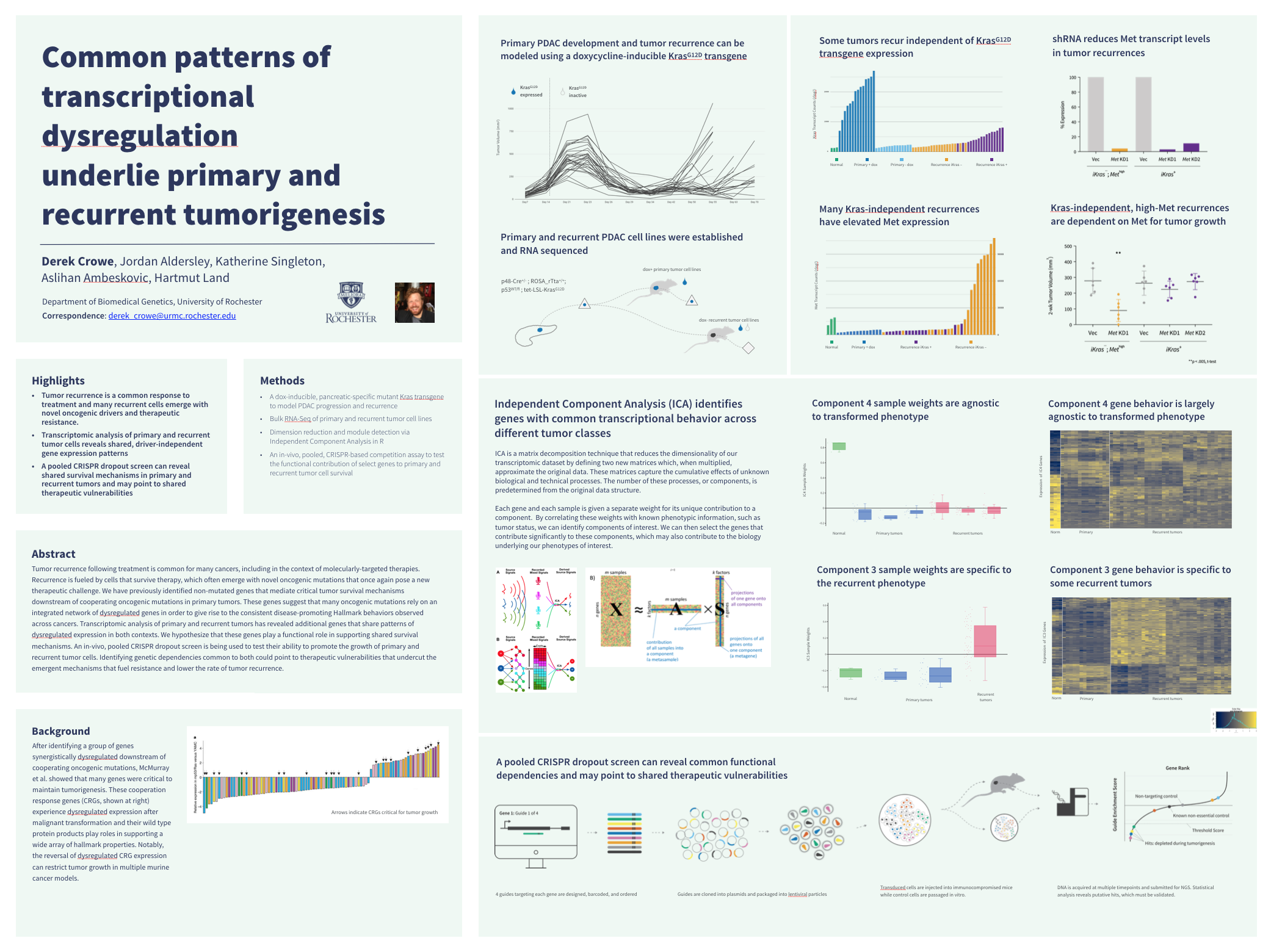
These posters were designed to facilitate multiple different poster session interactions. A concise title, highlights, and a summary section allow the poster to function completely autonomously; the inclusion of a graphical abstract makes it easy to give a short summary to help your audience gauge how much time they wish to spend; and the remaining space can accommodate enough data to fill a 20-minute presentation.
See a timeline and running updates on this conversation here.
Downloads
Butter poster templates (“Better” is a hard name to top, so I went with Butter)
There’s no need to request access, just click on the download button in the upper right-hand corner.
Updated to version 3 in 3/2020. See the timeline link above for some details about the changes if you’re interested. I’ll be back again soon to explain them more thoroughly, add more color options back in, and get a portrait version up. For now there’s one slide illustrating how my actual data fit in, and one empty one for you to start with. I recommend you let your data tell you how to lay it out. How many main sections (separated by thick lines) do you need? How many subsections (separated by thin lines) do you need? What’s the best way to make them flow?
Fonts
- Source Sans Pro (Latin, Cyrillic, & Diné bizaad (Navajo) characters)
- Source Han Pro (Chinese, Japanese, Korean, & Vietnamese characters)
For either, click “latest release” on the GitHub page and download the .zip file.
Wondering how to install fonts on your PC or Mac?
Highlights
- A well-crafted message is more important than any layout design.
- Posters are performances and audience members should have a voice in their experience.
- Visual design principles can help make poster sessions more effective.
- All academic disciplines can help us approach our world with curiosity.
Summary
Mike Morrison’s better poster style encourages scientists to distill their message, a critical step in creating effective posters. Dramatic physical layout constraints are the primary mechanism employed to help users consolidate their story, though this strategy costs a significant portion of the available poster space. Principles of visual design can guide users to achieve the same effective communication as intended by Morrison without sacrificing valuable poster real estate, as demonstrated here in a series of new poster layouts. These designs also incorporate user experience (UX) considerations of realistic time and social expectations during audience interactions at poster presentations. Multiple variations are offered in attempt to accommodate a wide variety of preferences and use cases. (Also, science jargon aside they’re just some free powerpoint templates on a website; you monsters can do whatever you want with them.)
How to make and use a butter poster
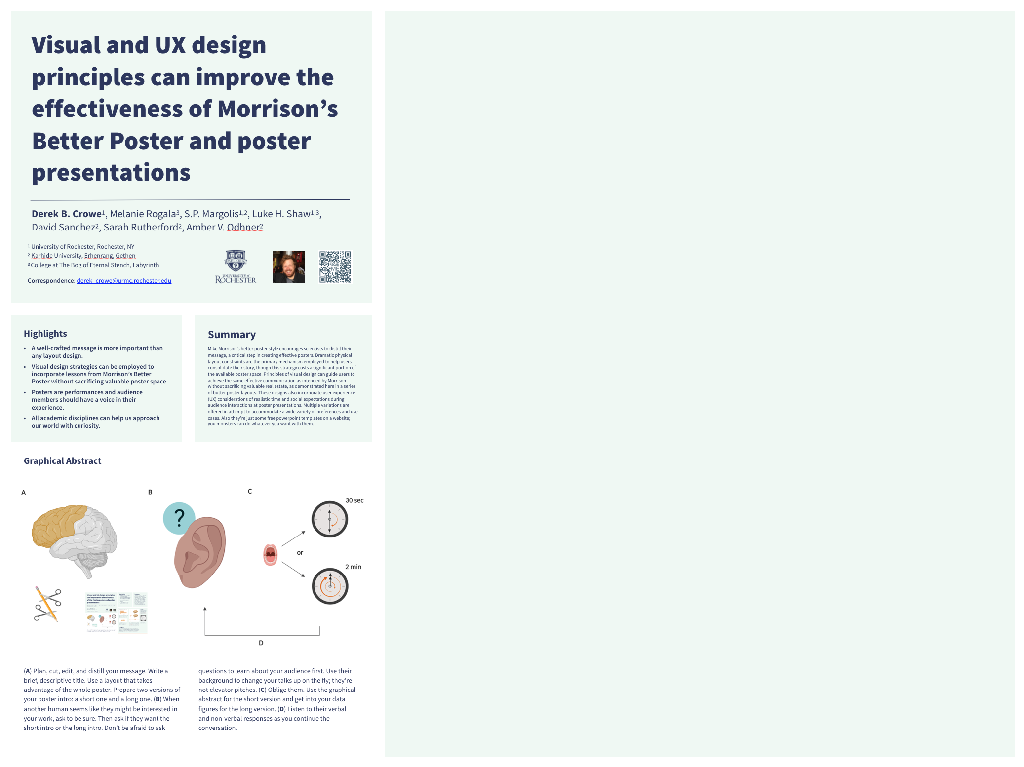
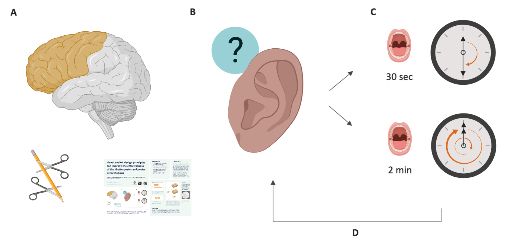 (A) Plan, cut, edit, and distill your message. Write a brief, descriptive title. Use a layout that takes advantage of the whole poster. Prepare two versions of your poster intro: a short one and a long one. (B) When another human seems like they might be interested in your work, ask to be sure. Then ask if they want the short intro or the long intro. Don’t be afraid to ask questions to learn about your audience first. Use their background to change your talks up on the fly; they’re not elevator pitches. (C) Oblige them. Use the graphical abstract for the short version and get into your data figures for the long version. (D) Listen to their verbal and non-verbal responses as you continue the conversation.
Morrison’s better poster is a breath of fresh air
Recently introduced by Mike Morrison, the better poster is a powerpoint poster template designed to increase the effectiveness of poster sessions; a communication modality common among academic scientists. The better poster style is different from the accepted style in two fundamental ways: First, it limits the amount of poster space available for content. Second, it centers a large, concise title. Fundamentally, both changes encourage presenters to omit superfluous content. In order to use the better poster one must pare down—or distill—their message and identify the minimum amount of content required to tell their story. This is perhaps the most critical and time-consuming step in crafting effective communication. That the style has encouraged scientists to engage in this difficult work is remarkable.
The better poster achieves this feat through one simple—albeit nuclear—mechanism: it mandates that 60% of the space previously allocated for content be used instead for a more thoughtful title. The growing popularity of the style demonstrates that blunt-force design constraints can be an effective way to encourage presenters to better distill their message. This popularity also begs a dumb question: if effective posters can be built after restricting content to a box that’s ⅔ of the poster size, why don’t we just start with smaller paper?
This possibility might actually be worth entertaining, but on the surface it fails to address a key takeaway from Morrison’s UX-centered evaluation: audience members need a way to quickly assess their interest in posters while walking by. This is why he proposes a large, concise title. Another relatively simple design constraint has helped us remember what a title is: one readable sentence that clearly states a research finding!

Morrison’s better poster structure. The center is for a title and the white blocks are reserved for data. Speaking of titles, please end the practice of bolding random words or phrases in titles. It makes for a very choppy read. Bold the whole thing if you’d like; it is a title. Also, keep the text left-aligned (why?) and avoid too much space between lines (what?) for improved readability. These are the most common typesetting issues I see with better poster use.
Mike helped us come to realize that in order to make posters more effective, we need 1) a large readable title and 2) much, much less content. His proposed solution, however, costs the majority of the available poster space. Well-established visual communication strategies can offer an alternative: a style that encourages distillation and takes advantage of the totality of available poster space. Tools such as a grid, visual hierarchy, white space, and typography can be used to prompt distillation and help readability without sacrificing space. Carefully applied design principles have the power to heighten the effectiveness of the better poster.
Before we can design an effective layout, however, we must retrace Mike’s steps and ask what we want the user experience to be like. The answers to these questions will create a sandbox of constraints in which we can play with our design tools. One question I like to start with in these exercises is: what do you want your communication to accomplish?
Posters are actually presentations
That question has lots of answers, but to me the main task of a poster is to serve as a visual aid in my presentation. Which... is a presentation. Like, exactly the same thing as a talk except without a projector. Just me and my slides, which happen to be printed on paper, which happens to be tacked to a board right next to me, a presenter, in front of an audience. I’m giving a presentation. You get it. From that perspective, I should apply to my poster design the same constraints I apply to building a talk.
 One person would prefer all their conversations to be 5 minutes or less. I love that.
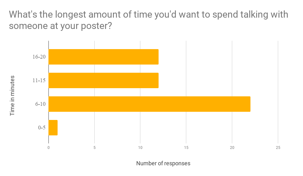
First, I need to know how long the talk is going to be. So how long should a poster be? I asked over 1,000 graduate students from all kinds of disciplines to tell me the longest amount of time they would prefer to talk with someone at their poster. I chose to word it that way to capture the upper-limit for how much time we might plan. Of the 47 who responded, roughly half said they would prefer to spend no more than 6-10 minutes with any one person (or group). Another quarter said 11-15, and yet another quarter said 16-20. So a good portion said 20 minutes but most said 6-10. At the risk of introducing artifacts from focusing on ‘data’ from the upper-limit of my upper-limit ‘survey,’ for the sake of this let’s play it super conservatively and plan for a 20 minute talk.
Next, I must determine how many slides I need to communicate my story in the time I have. So how many slides of data do I need for a 20 minute talk? A mostly-made up but seemingly reasonable estimate is 10, which corresponds to roughly two minutes per slide. Let’s also assume each slide has one main piece of data. We’re not talking about bullet points of text here (which you should eradicate from your slides ASAP); we’re talking one finding per slide.
This title is actually very large when printed... and look at all that space for other stuff!
The magic of powerpoint presentations comes from the fact that only one slide is shown at a time. This talk is being printed, though, so I have to think about how much poster area I need for 10 slides. At the distance most folks will be viewing your poster, I think its safe to print two slides (that’s two figures or images) on one 8.5x11″ sheet of paper. This corresponds to 5 sheets of paper, or roughly 470 sq in. The first two butter poster layouts give 550 sq in., and there’s even more built into the third.
Remember this is the most conservative scenario of a 20 minute presentation. Most people reported preferring a 6-10 minute talk, which would require even less space. So if you’re one of those people, don’t be afraid of leaving empty space on your poster! Say what you need to and nothing more. In the better poster video, Morrison acknowledges:
“If you’re trying to put so much into that [space] that it doesn’t fit, they won’t have time to read it anyway.”
And nor will you have time to present it in the time you reportedly want to spend!
Presentations are actually performances
So we can accommodate up to 20 minutes, or 10 slides worth of presented data, but what about the more typical use cases involving frequent, brief interactions? Mike lovingly calls-out these wonderful moments in his video and this is how they go: someone comes up, says “hello,” and avoids eye contact at all cost while scanning your poster. After about 15 seconds, you muster the gall to inform them that you are, in fact, standing just over here... about 12 inches away... in case they have any questions. They respond with “ok, great,” feign interest for another 10 seconds, nod, say “thanks,” and walk away. What about those situations?
 A graphical abstract, highlights, and summary section all help to accommodate different types of interactions. Even without any data, these sections provide a very clear understanding of the work. If I’m not standing next to the poster, you can easily read the highlights and summary to decide whether you want to come back. And if you ask for a 30 second version of my story, I can use the graphical abstract to quickly lead you through it.
 Assuming, for the sake of argument, that you would very much prefer to avoid that whole thing entirely, how about simply asking what they want!? Some folks are going to know they’re interested from the title and some need some more time. Instead of weird reminders of my presence while I let them figure it out, what if I proactively ask a question and pre-plan for two possible responses? “Hi, I’m Derek. Would you be interested in a short 30 second version or longer 2 minute version of my story?” Critically, the main function of this question is to establish consent. It gives the situational power to the audience member by giving them a choice. They might be feeling awkward because they haven’t yet figured out how much they care. Even if I’m feeling uncertain, though, I can agree to a 30 second committment. After, I can easily say “thank you” and dip, or I can stay and ask more questions. Alternatively—and perhaps most importantly—I can also say “no thanks!” and move along. And if conflict-avoidance prevents you from saying “no thanks,” you only lose 30 seconds.
Storytelling in front of an audience—even for 30 seconds—is a performance. If I invest the time to make a graphical abstract, that 30 second performance is just about rehearsed. My two minute version requires some practice, but it also gives me more room to read and engage with my audience before starting. If someone is confident that they want the long version, I can ask what they already know so I can tune the amount of jargon I use to guide them through my work. And that’s when I’ll start to look to my data for help.
A butter poster
Now that I’ve established the constraints on the interactions, I can design some layouts that meet all my needs. Here are the butter poster layouts I’ve built around these considerations. First and foremost, they have room for a ton of your data and they feature a huge title that signals easily to passers-by. Additionally, all the content sits on an invisible grid that facilitates fast parsing of the content. There is ample white space, which keeps things from feeling cluttered, reduces eye fatigue, and also physically restricts the amount of content you can add.
Next, I took notes from Cell Press and worked in a graphical abstract, bulleted highlights, and a short summary. These are the bread-and-butter of the short, 30 second performace I’ll practice. Additionally, these elements are critical for another use case: standalone mode. I want my poster to function when I leave to be an audience member, visit friends, or use the bathroom. Folks can quickly read the highlights and summary in lieu of my 30 second spiel.
I utilized one, freely-available, professionally-designed typeface family with wide language support (latin, cryllic, CJK, and Navajo characters are included) called Source Sans Pro. It has six upright and italic weight variants that allow me to establish a typographical hierarchy, which subtly guides a reader through the content. I chose a handful of delightful (to me) and accessible color palettes to include in this release, but many variations are possible.
Finally, I’ve layed it out with room for authors, affiliations, contact info, and a spot for a photo. I’ve also included a QR code because I’m with Mike on this one: even if underutilized, they’re a wonderful way to link to a publication, website, or more info! No app needed; just use your phone camera. All of these elements are nice to have and also critical for the poster to function properly well when I’m not there.
The data you include will obviously change... unless you’re presenting my thesis. When laying this section out, please for the love of Science just give your figures some room to breathe. Try to keep them on a grid, give clear titles, and include detailed captions. Ask yourself if a rando could tell your story using just your poster. If not, edit your titles and captions until they could. Fundamentally, distilling your work up front and deciding what you do(n’t) need to say matters so, so, soooooo much more than the layout. Hopefully these designs will continue to encourage that practice.
Final notes
These layouts are for everyone and anyone to use and remix. Not that you need encouragement, but do your worst. Let me know if you want some specific use cases considered and I’ll do my best to add a version. I’ll get some portrait layouts up soon. Huge thanks to Mike Morrison for busting open this conversation, and additional appreciation to Colin Purrington, the Better Posters blog, and countless other communicators (also see updates below) for their contributions to this topic—they all have really cool valid things to say that are different and important for this ongoing conversation. Please don’t hesitate to reach out with comments, questions, or suggestions!
If you want to make graphical abstracts outside ppt (and are in the life sciences) I recommend using BioRender, which is what I used to build the one for these posters. And if you can spare some $$$, take this wonderful class to learn about how to make them! If you want to pick your own accessible color palettes, use CloudFlare’s awesome tool. If you want to play around with different font choices, I recommend you skip the fonts preloaded on your computer and look here for free options that aren’t terrible (or get real fancy here or here). QR codes can be generated here.
And lastly, if you find this useful, consider how STEM-focused rhetoric necessarily excludes the contributions of fields like design—disciplines that work to facilitate our ability to perform the scientific process, which includes communication. Words matter. This world is weird AF and we need all the help we can get in approaching it with curiosity. If we desire for others to learn from our work, let’s demonstrate what that takes by listening to theirs.︎
See a timeline and running updates on this conversation here.