
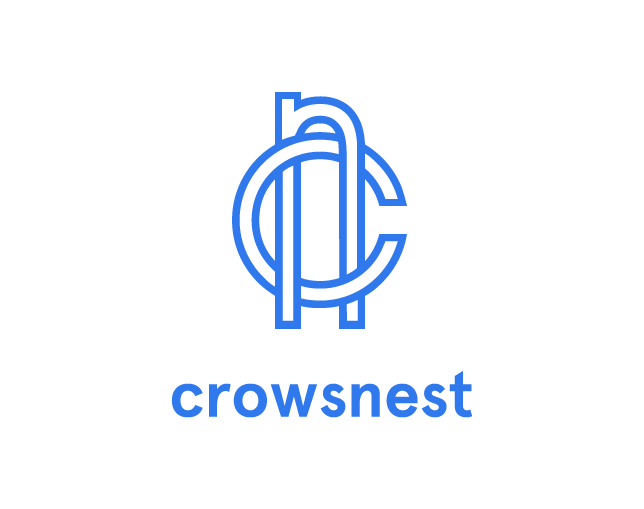

Mike, Ian, and Josh of crowsnest.io wanted a nautical identity for their internet of things API. While perusing a old book of embroidery monograms I won at a letterpress conference, the height of the n struck me as a perfect reference to their company name. The combination was modified to remove florid ornaments and include the heavy inline stroke. Aperçu was an easy compliment, having been designed as a combination of many classic, lineal faces commonly found in wayfinding and navigation signage. The colors were inspired directly by sailboat paint combinations I stumbled upon in Maine.